
Design System
A shared core.
Room for the product.
A complete UI kit gave us a starting point. My work was adapting it to the product: changing inputs, refining buttons and radii, and combining those foundations into reusable product patterns. GifTaTy’s Core Design System shows that approach in practice.
01 ADAPT THE FOUNDATION
The kit was the starting point. The product set the rules.
For each project, we began with an established design system and adapted it into a project-specific Core Design System. The latest example here uses Untitled UI for GifTaTy.
The work was selective. Existing components gave us coverage; the product determined where that coverage needed to change. Inputs needed different content types and states. Buttons, cards, and modals needed a consistent treatment of shape and hierarchy.
The library includes inherited components as well as project adaptations. The examples below focus on the component behaviour and composition, rather than claiming the entire base library as original work.
02 THE INPUT FAMILY
One field is not enough for every task.
Inputs were one of the components we regularly changed. The GifTaTy Core file contains default inputs, leading icons, leading dropdowns, trailing text, and counters, with placeholder, filled, focused, disabled, correct, and destructive variants. The Counter type is a numeric quantity input with decrement and increment actions.
The adapted field groups its label and value inside a rounded container, with supporting text beneath. That structure lets the field keep its identity as its content and state change.
 KD
Enter a value, or explore the states above.
Interactive reconstruction of the custom Input field family. Example values stay in this page.
03 A SHARED ACTION LANGUAGE
Change the emphasis, keep the behaviour familiar.
Buttons needed a common structure across sizes and levels of emphasis. The source library defines primary, secondary, tertiary, and link hierarchies, alongside hover, focused, and disabled states.
For GifTaTy, the primary action uses a dark indigo. Its default and hover colours, 12px radius, and medium-size spacing in this example come from the Core component.
Click feedback is a demonstration of state transitions for this case study.
04 A REAL PRODUCT PATTERN
A number, or no limit.
The Add Gift screen combines the Core Counter input with a secondary button. The label “How many?” gives the pair a purpose: choose a quantity, or mark the wish as unlimited.
The input and Unlimited button are both 62px high in the source screen. Their 16px radius aligns them as one pattern; the minus and plus actions remain inside the numeric field.
How many?*
Rebuilt from Add Gift, including its numeric Counter and Unlimited action.
See the original Add Gift screen
05 ATOMS → MOLECULES → ORGANISMS
A component becomes meaningful in context.
Our wider workflow used a separate Template and Organizations file to assemble reusable patterns from Core components, following atomic design. The repeated parts used real product content and could evolve as flows improved.
GifTaTy has no separate file for that layer. Here, the actual gift-detail window is reconstructed from its parts. Move from separate components to grouped patterns, then to the complete organism and its wishlist context.
The parts, before they meet.
The components needed for this gift state, separated so you can see what each contributes.
Waiting for a friend to accept.
Once someone accepts, the gift will be reserved and your group will be ready to plan together.
Dyson hair dryer
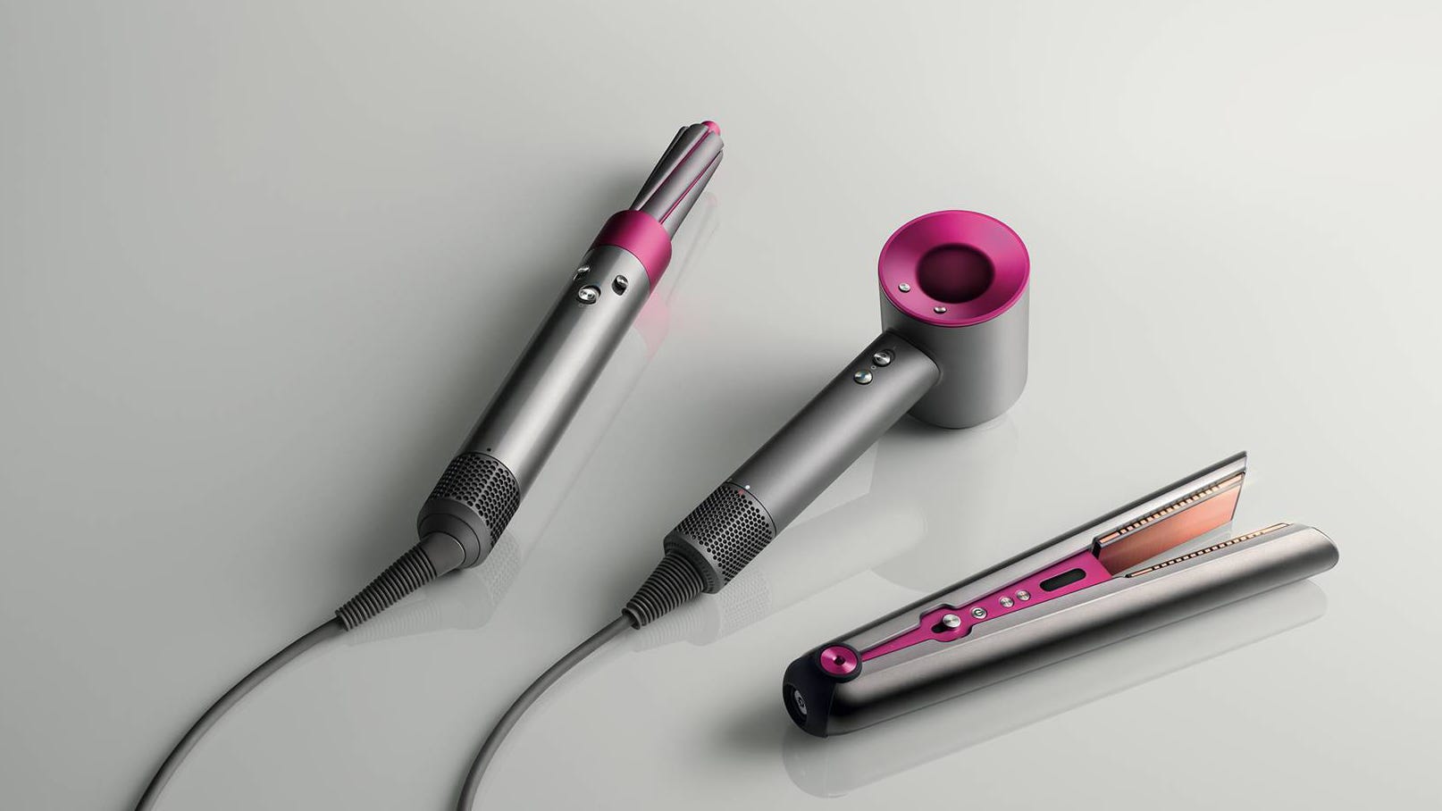
Virgin Megastore Qatar


Available, personal reservation, and split-reservation states are taken from the product files. The design-state selector is a case-study control; it is not part of GifTaTy.
See the original product screen
06 CONNECTED LAYERS
Refine the core. Reuse the composition.
The separation between Core and product patterns gave each layer a clear job. Core held the reusable primitives and component families. Compositions brought them together around content and flows that repeated inside a product.
- Start with coverage.Choose a mature foundation rather than recreate every standard control.
- Adapt where the product needs it.Refine inputs, actions, shape, and missing states in the project’s Core.
- Compose with real content.Use those components to build repeated product blocks and templates.
- Improve the repeated pattern.When a flow changes, update the reusable composition instead of treating each screen as an isolated layout.
That is also why this case study is interactive. A system is easier to understand when you can change a state, open a surface, and see what remains consistent.
07 REFLECTION
The value was in making the foundation fit.
A large library did not remove the need for design decisions. It let us spend more attention on the parts that belonged to the product: which inputs were needed, how states should read, and which combinations deserved to become reusable patterns.
My contribution was adapting that foundation and connecting it to product work. The result was a project-specific Core and a repeatable way of composing interfaces, without having to author every basic component from zero.